

1st Place
1st Place
2015 - 1st Place
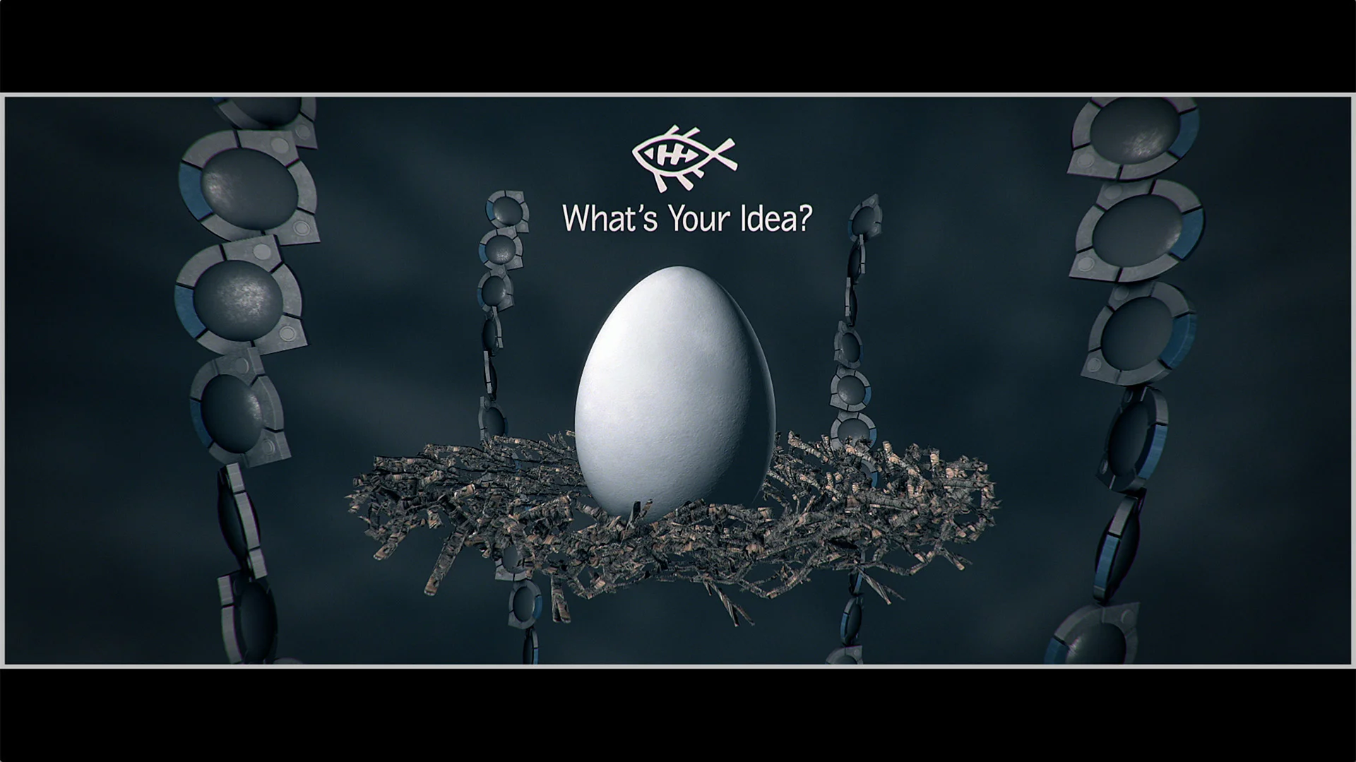
"The Tree of Logik"
by Deron Hoffmeyer
From Deron:
My One Frame of White entry The Tree of LOGIK, is really a mini tribute and love letter to the LOGIK community. I just joined the group in 2014 but I've found everyone to be so talented, friendly, and helpful it feels like I've been a member for much longer. I absolutely love this group!
Originally, I had a completely different and much more involved concept for OFoW. I had done some storyboarding and rough concept art for that idea, but in the end, it was going to be a lot more involved than what I was going to have the time to do. I put it aside and thought perhaps I wouldn't submit anything this year.
As the deadline was getting closer, and a nagging voice inside my head kept telling me to do SOMETHING, I started to think again about what I could do and I decided just to go for something that I knew I could pull off technically that would still be cohesive with some kind of theme or story to it. It started as just the simple idea of a bunch of animated shapes quickly shooting and growing out of an egg that would eventually lead to another egg at the top. I started sketching and storyboarding, but I didn't have the idea that would tie it all together just yet. I did a very quick test one night just to see if I could build something that resembled an egg cracking open. When I liked the way it was looking, I knew at that moment I needed to finish it. From that point on, and almost immediately, the idea of making it about the ideas and contributions from the LOGIK group in the form of a tree came into being. There are so many amazingly talented people in the group who are an inspiration, but I knew right away that in such a short entry, I wanted to call out Ivar for his relentless contributions to the matchbox and now lightbox world, to Greg-Paul with a funny tribute to his amazing 2014 winning entry, and to J...who got us all together in this awesome group to begin with!
From then on, it was a mad-dash race to the finish given that I started that first egg test a mere 7 days away from the submission deadline. I worked almost every night after work and over the one weekend I had available..many times into the wee hours. I decided very early on that since I was starting this concept so late in the game, that I was going to need to cut a lot of corners to save render times. I made the creative decision to stay far away from photorealism, motion blur, and depth of field and to just embrace a more crisp, graphic, and stylized look. I decided to keep the lighting very simple and decided to go for a minimal color palette, no cast shadows, etc. I also decided to treat each scene within "the tree" as its own action setup (with linked camera setups) so that I could quickly get the lighting looking close within each scene and not have to worry about lighting this massively tall space.
I tried to keep renders as lean as possible, but the biggest render hog were the replicated "node" geometries of the tree itself. The renders came to halt once you got up to 20-30 replicas so I ended up pre-rendering those layers once I had a camera move I was happy with. I also discovered that you max out at 100 replicas! I needed more, so the very last lift of the piece is actually a new tree that sprouts from behind the TIE. Those pre-renders took just under an hour if I remember correctly and the final render was about the same.
Aside from this being an incredibly fun and rewarding project to work on, I learned quite a few things along the way. One of the things that stands out the most is the idea of cheating the look of lighting by baking some of that in to the textures itself. For example, the pools of light on the TIE platform are just color corrected shapes. The foam on the water is just the animated diffuse texture itself. I can see myself using this approach even more in the future.
In the end, it was so much fun to just watch the final render with my quick and dirty sound design and realize that it worked!! What started out as just some scribbles on a piece of paper turned into something that I actually enjoyed watching and it put a smile on my face! I am so happy that I decided to just MAKE something! It felt great creatively and it was SO nice to have both Andy Milkis and Shia LaBeouf encouraging me along the way to just.....DO IT!
-Deron
To leave a comment or share on social media, click here.
2nd Place
2nd Place
2015 - 2nd Place
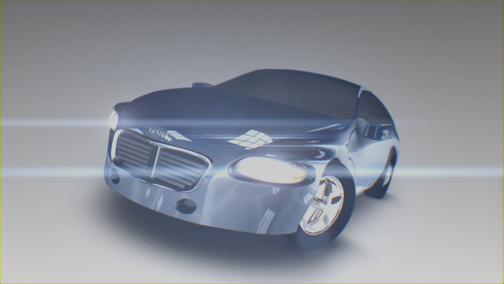
"Smoke, Drink and Drive"
by Inti Martinez
From Inti:
I always wanted to do a beer bottle, a full render, product shot like, but never ran into it at work. I thought OFoW was the perfect opportunity to do one. The car came later... once the bottle was getting into shape I felt like it would be a good idea to do a car, using the same technique.
- 95% of the piece is made out of extended bicubics.
- Big use of displacement maps.
- A few default 3D models here and there and 3D text.
- It is all fake, all made out and fully customizable.
Modeling was the fun part, it was fast and intuitive, I missed not to have the 3d shape on the smoke, or deformers, but the bicubics are like a big deformer box anyways. For the shader, I needed a dual material for the car paint. I could not found a way to export two or three different specular passes out of action, that's why I had to duplicate the tree.
Rendering took around 30 minutes for each scene. I welcome someone to turn motion blur on with 12 samples at least. :-)
To leave a comment or share on social media, click here.
3rd Place
3rd Place
2015 - 3rd Place
"Powers of Ten"
by Bryan Bayley
From Bryan:
The "Powers of Ten” idea came from this 1970’s educational video: https://www.youtube.com/watch?v=0fKBhvDjuy0
I hope anyone who opens the setup and pokes around can find something interesting. I tried to use a little bit of everything that makes Flame so fun to create from scratch. I play with 3D Shape and Replicate and I use lots of spheres to try to build interesting things that might otherwise be hard to model & animate. The DNA comes together via replicate animations. The Virus model has simple rigging to make the legs move via one dummy axis. A lot of the HUD elements are action presets with tweaking. I love Optics, Lens Distort, and Chromatic Aberration (and I hope my use isn’t too gratuitous.) I use Substance Textures as a starting point but they really slow down the system once you start replicating and building up geometry. This is one area I hope Flame can improve. Overall it was a fun experiment and there are a few things I learned that I will use again on other projects.
To leave a comment or share on social media, click here.
Honorable Mention
Honorable Mention
2015 - Honorable Mention
"Evolution of the Flame Logo"
by Robert Coulin
From Robert:
I called it an “unofficial entry,” as i see it more as a layout, which would need finishing.
Overall production time was around 2 days.
Rendering of the setup (Flare on MBP) was around 17 min
I would like to start with the admission, that i have been using images in the preparation phase. I had the logos as backgrounds - sort of reference for drawing the mask (freehand mode, was easy ;-)), then for animating into the later modern fish, also the flame background and origami icon had to be done using an image for reference.
The idea to show the evolution of the logo wasnt my first plan, but developed over time. The only thing i had been sure of, was to start with a blank white frame, which should then evolve into something. At first i had written “oneframofwhite" and wanted to pimp this handwriting with some particles - that soon lead to integrating the flame-logo and later to a (more or less) continuous animation.
Of course the logos had to look 3 dimensional, which was easily achieved with displacement mapping. Displacement source was the same image with some shrinking plus a multiplied noise for the old logo. Animating the Gmasks old fish into new fish was relatively simple, although consistently showing the bug, that the priority of the masks would not save.
The star was not suitable as an intermediate morphing state, as it had not been flame-specific in history either. So i just had some particles pop up randomly during the fish morph.
Using a full frame image as emitting source of the particles didn’t work out for random distribution, because the origin of the few particles appeared to concentrate around some areas, for no recognizable reason. The alternative i used, was to have a light as particle source, with a noise expression on x & y position, which worked quite well. The transparency got a function for a smooth fade out.
So far all was greyscale and now colour came including problems. The look of the logos, which build up the flame screen-background appears to use coloured shapes with high transparency, so the colour is adding on the overlapping areas. For better distinguishing the shapes got sharp highlights at the edges. All this seemed a bit hard to reproduce with the 3D modeling capabilities of action and was heavily compromised.
Also the distribution of the logos in 3D-space was hard to reproduce. It would have seemed simpler with a 3D-path, but that would only work with a 3D-text with a logo font, which wasn’t according to the rules. the only solution possible was using Replica nodes. 2 Replicas were necessary to get independent procedures starting from the middle of the imaginary path to the front and to the back.
The new “F” icon was also not so simple regarding color reproduction, i tried all transfer modes until finding something close, which also needed a specific grey level as background, and this for all individual elements. The particle animation is the same as the one of the discreet-stars.
Then the fish spread on the background should disappear, which was achieved by using the respective opening animation with a black front multiplied. Finally it appeared logical to end with the original flame logo, which would just be revealed by the aforementioned animation.
Last were the titles „evolution“ and „one Flame on white“ as simple reveal animations. This had been prepared by a simple animated Gmask, which constantly showed another Gmask bug: the inconsistent scaling. So i finally used a black frame animated with 2D-transform as a matte & done.